Uncategorized

A Look Back at Semester 2…

Well, it turns out that grad school pushes everything else to the side (surprise!) and I have’t updated this baby in umpteen months. Here’s a look at what I’ve been doing for the past 5 months…

When last the internet saw me, I was flailing about with dye and a red cape, I believe. After that, I really had the spark of interest for learning about dye, so I did a few experimental pieces, just playing with color, stitching, form… seeing what I can do with the dye; how it’s like paint and how it isn’t. I was also expanding my range of surface design techniques so I embroidered some sacred geometry-based designs into them, thinking I might take this into actual quilting at some point.

6

4 1 3

Originally these were conceived of as straight yardage, no pre-conceived functional end-goal, but once they were complete and I was living with them, manipulating them and draping them, I realized that there is really something about clothes that resonates with me. When I hung one on the wall–meh. When I wrapped it around my shoulders, instant shift. Suddenly the piece had a life, purpose, character.

I didn’t want to cut them up, so I worked the pleats in to make the fabric bend around the body as a wrap. I left off any closure or distinctly garment-related findings to let them keep living in this space between garment, wall hanging, pure textile…

I was completely stumped in how to display these for the final show, and I think that ultimately failed. I tried both hanging them on the wall and on a form, and I felt that they fell pretty flat. Which brought me to this semester. This semester I was focused on both honing the concept and narrative behind the work, as well as examining presentation possibilities.

I thought that I’d stick with garments, but let myself go a bit mad with the surface design work. I really wanted to try more dye techniques. I decided to keep the cape as my control garment, to create some parameters/boundaries. Plus, as I’ve been working with concepts of fantasy worlds and transformation, what better garment to use? Capes have such an inherent fantasy feel, and really engulf you into an experience in a way few other types of garment will. This first one is the Seeker cloak: I’ve been reading a lot of Jung, Campbell, and YA fantasy, okay? The visual inspiration for it is Hubble photos of galaxies; I wasn’t trying to say anything particularly spacey, but I am moved by the idea of a type of warrior/seeker/mage character who is wrapped in the fabric of worlds. Also, creating a galaxy with dye sounded hard, thus, something I had to try.

I drafted the pattern and sewed the first one together. It started as pure black velveteen:

IMG_4628

…aaaand then threw bleach all over it.

Before anyone gets shirty about it, I did use bleach-stop, so it won’t just eat the fabric away.

IMG_4632

Bleach galaxyIMG_4635 IMG_4640

Next, to begin adding color:

IMG_4656This is it in stage 2 or 3, after a few rounds of dye:

IMG_4659

Then more dye:

IMG_4705

Then stars:

IMG_4713 IMG_4732 IMG_4739 IMG_4740 IMG_4789To the final:

capes-38

capes-41capes-37

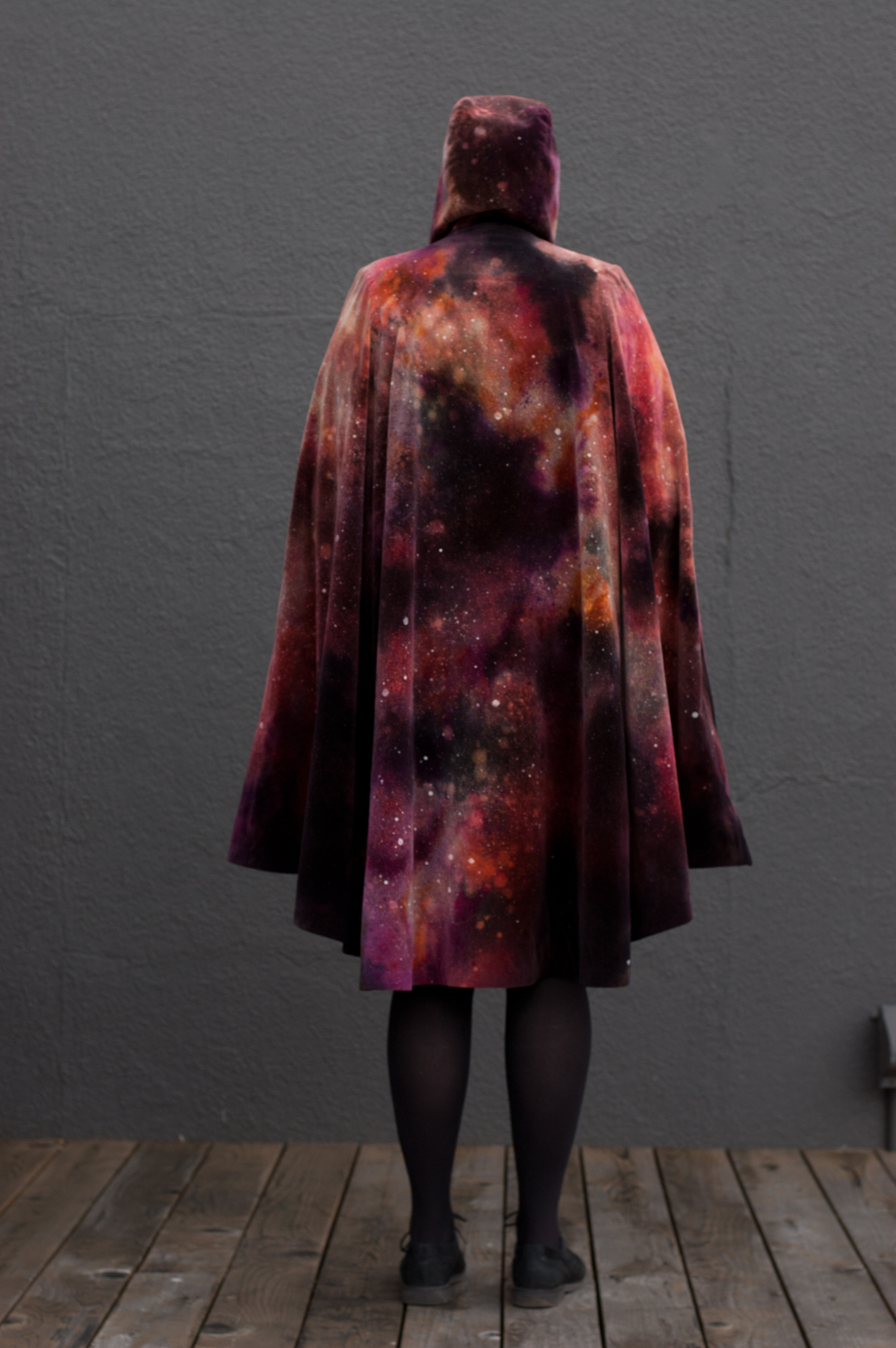
It’s lined in purple poly satin that is dip-dyed into an ombre effect; dark at the hem, light at the neck. There are long-slit arm vents on either side of the double-breasted facings, for ease of movement and utility of the hands and arms.  It’s also got multiple pockets on the inside facings, as well as two inset pockets in the arm-vents, because adventurers need lots of pockets.

After the Seeker was complete, I simultaneously began work on a second cloak and an installation for them to live in. Being as I had so much dissatisfaction with presentation of last semester’s work, and at the urging of my awesome mentor, I began studying installation art and set design. Fascinating and amazing stuff! With the final show approaching, I realized that I could either keep the installation part somewhat toned down to make sure the capes were front-and-center, OR I could let myself really run with the set install, realizing that it might, for this iteration, take away from the capes as centerpiece. For this go-round, I said fuck it, let’s go crazy. I can always come back more towards the middle to privilege the capes later; let’s build something weird. I’ve been very interested in the blending of worlds, the dichotomies of inside/outside, not to mention the mythology and language of references in well-known stories, so I wanted to build a bit of a forest moment indoors. I also thought, in terms of a forest scene, that perhaps a tree opens, almost as a wardrobe (yes, intentionally). Quickly this came together in my mind as a piece speaking to Campbell’s Call to Adventure and Crossing of the Threshold, a concept that seems particularly resonant these days…

So I began building it:

This was a particularly fun, but also nail-biting, adventure. I’ve never done anything with building, much less installation before, and that, combine with having maybe 3 weeks to do it, equalled, in hind-sight, pure foolishness. But I am nothing if not a fool! I decided to go for it, with the knowledge that some of this would be an exercise in cobbling things together; it didn’t need to be perfectly polished on this go-round.

IMG_4974

First I built a closet-form out of MDF board

IMG_4975

…and painted it gold. And realized I’d made the damn thing too tall for the spray booth. Oops.

IMG_4979

Here’s the door. I found a banged-up piece of mirrored plexi in the studio and cut it into that shape on the band saw.

IMG_4994

More on this later, as I have to run out the door now. Tomorrow: Tree-Armoire part TWO!

Standard
Uncategorized

wow… shit got real.

Awright, so it’s been an age and things keep piling up to blog about. I have several art hunt-related things to, um, relate, and i made a bunch of stuff, and there’s all sorts of things I need to report on, and it’s gotten to that point where it’s gotten to big to tackle so screw it I’m starting here.

Short version: I went to Portland to check out a potential school to apply to for fall 2015 (remember all the coat stuff for portfolio work? That’s why). And I really liked it. Then I went to LA with the lovely Emma and did and art hunt down there (someday I will properly post about it but LA you were VERY CRAP in terms of responding to the art hunt so you are in my doghouse) and while I was there I got an email from the head of the program I was interested in inviting me to apply for THIS year, as in rightthefucknow. I said no no I couldn’t possibly no and then my darling husband said YOU HAVE TO DO THIS (did I marry a catch or what?) so I pulled together an application, transcripts and 3 letters of recommendation in ONE DAY (eternal gratitude to my former professors and good friends who came through there). I got accepted the very NEXT day, which was about August 1. Christ on a biscuit.

So I had to move to Portland. OH! and my school (MFA of Applied Craft and Design, a joint program offered through PNCA and OCAC, for those of you curious or just particularly fond of acronyms) has a design-build project they do with the first years every year. No way I was going to miss that and be the weird kid coming in late, so I flew to Portland on the 10th, built the most badass chicken coop ever for 10 days, flew back to CA, and had one week to pack, say goodbye, and, well, leave.

IMG_4081

I spend a lot of time in this building now.

I lucked out majorly with housing in Portland, as an old roomie and friend from SF just HAPPENED to have a housemate moving out on September 1st. And the house just HAPPENS to be awesome. And in a sweet neighborhood and only 2 miles from school. So that’s that. Jason’s holding down the Crockett fort and the dogs and the site/store is down for now because I have not EVEN been able to think in a retail-minded way. I need to open it up again soon… I planned to do it before now but grad school has taken over my whole brain like some well-educated parasite that uses words like “process” and “intimacy of the object.”

So that’s that. Prepare for this to become a log of grad school stuff for a while. I’m sorry. So far, my mentor (my school id very mentor-based) has told me to let go of my product-driven, a-to-be process for a while, to nurture my creative practice, to let things in and gather influences and see what comes up. Sound wonderful? It is but goddamn somehow it is still so hard! I am very stuck in the concerns of making a dollar RIGHT NOW and thinking of audience, market value, salability. I’m sure all that will come back, but I’ve been given this time to stretch and grow and hopefully become a more realized (and balanced) creator, but it is hard to shift that way. Grad school is immensely open-ended and almost entirely self-driven, so deciding if you are doing the right thing or not is tricky. I have been getting very elemental and a bit new-agey in simply trying to trust my impulses. Currently my impulses have me painting on My Little Ponies, but more about that later. I promise to have some pretty pictures soon; this post is quite wordy. Should you want to be inundated with pictures, go follow my instagram. I have taken to posting pictures of strange things I find in vintage shops here, so be warned.

xo

Standard
Uncategorized

Coats 101

It is finally time for me to make a coat.

Coats (and jackets) are probably my favorite garments; there’s something very security-blanket-meets-armor about a good coat. And I have been afraid to try making one. So many pieces! So many details! So many notions! Interfacing! Buttons–what?! And what the hell is wiggan? But I’m going to do it. I believe I ranted at length about it in this post, but the direction I am wanting to move in, artistically, (read that with a posh accent), is towards unique, hand-crafted outerwear. An intersection between art and function, spanning both. 

In school, I was allowed to be completely immersed in art for art’s sake; making and experimenting and not worrying about a bottom line any more serious than my letter grade. Post-school, thrown into the (lack of) job market, working in a coffee shop, I became very concerned with commercial uses and marketability– making things I could SELL. Now I feel like I’m coming back to some middle way. I think art students are often underserved on learning marketing, branding and survival, but I also think being passionate about your work is important, and that if you do something that bores you just because you can sell it, both you and your work will ultimately suffer. 


This philosophical moment brought to you by Ponds Cold Cream.


Anyway, coats. And no, I still haven’t finished the purple patchy coat. It’s been the learning-horse, and largely what I learned was that I need to be able to make my garments from scratch and to design them myself from the ground up to get the result I want. So it’s sitting unfinished for the moment, though I plan to finish it at that elusive time we know as “someday.”

So I took a basic coats/jackets class and finally attempted my first coat, from a commercial pattern and everything! Woo!

I bought this pattern, largely because I have a weakness for stand-collars and double-breasted styles:

Image

I bought a gorgeous, but complicated, damask-print canvas fabric. I also, at the urging of awesome-teacher Diana, decided to pipe the seams– a new trick for me, which I love and now I want to pipe everything. Piping for all! Piping on underwear! Piping on the dog!


Piping!

Image

Progress pockets… and more piping! The lining is a gorgeous orange. I should have matched the lining and piping but the piping was a last-minute decision, so it is red. This is not a mistake, this is a bold artistic choice!Image


I took a few more progress shots but they looked pretty dull so I shan’t include them. Suffice it to say this beast took a while. Matching the print alone took the better part of a day, and then once I put the coat together I realized it needed all sorts of alterations. Next time I will make a muslin for sure– I have learned my lesson!! I took in the sides, sleeves, bust and back, and there are more alterations I will probably add on if I ever make a version of this pattern again. So there are lots of “learning moments” on this coat, (like the hem. That hem and learning to line the thing nearly killed me) but overall, for my first coat ever, I’m pretty pleased. 

Finished coat, with neck unbuttoned. I disagree with this pattern detail, by the way. It leaves a strange gap in between the collar and front facing and if I make it again I think I’ll just join the collar and facing. I’d also extend the other side of the collar so the wrap and are symmetrical, but I like big high collars. It just looks weird to me with the one side longer than the other and hanging open like that.

Image

And buttoned. I like the look of it when closed. I opted for buttons just on the closure, rather than the intended double-row down the front. It just seemed too busy with both rows of buttons, and I rather liked the asymmetry.

Image

Detail.

Image


Partially open, I like the “lapel” effect but again, that top collar piece bugs me. Oh well. 

Image

Sexy rich orange lining. Next time I will add a back-pleat to the lining– it could use it for ease. 

Image

Action shots!

Image

I took about 4 inches out of the back– it was a pretty shapeless coat at first. 


Image

Image 

Image


Ta-Da!

Thanks to Diana and Better Living Through Sewing for the help and guidance. If you live in the Bay Area and want to sew I highly recommend her classes. Plus, it turns out she went to the same high school in Boulder that I did. Funny ol’ world, innit?


Standard
Makeup, Uncategorized

Makeup Thursday: Lunatick Unboxing!

Sooooo no new makeup look today. Why? Because apparently watching Netflix in bed is hazardous to your health. I managed to SMASH myself in the mouth with my laptop. The upside to this was I drooled blood everywhere and got to be a pretty excellent zombie for a minute there. The downside is that my mouth is all bruised and the part where my teeth went through my lip has become a very angry canker sore  and there is no way I am putting makeup on that mess. ALSO  I am feeling a bit ugly duckling today so I have put myself in time out until I can stop dissing on the weird shape of my nose and stupid face shape and lacking chin and… see! Cut that shit out! ,

I am teetering on the brink of a rant about “pretty” culture but I will refrain. Suffice it to say I love makeup and dress-up very very much but I wish I hadn’t been so inundated with the need to be “pretty” and base so much of my worth around the idea. I wish I didn’t feel that there are so many aspects of my appearance that are checks in the “bad” box. I wish I didn’t often feel that I look pretty good for a kind of ugly girl. How does this happen to us? How do we stop it?

If I were a socially responsible blogger, I would probably now launch into a thoughtful unpacking of society and hopefully make the world a better place, but I am not. I like colors and makeup and shiny stuff and that is about all I can handle today so let us leave the deep thoughts for another day and talk about a makeup company that is doing something right. That’s right, let’s talk about Lunatick Cosmetic Labs.

I only recently discovered these lovely folks and I have to say I am kind of crushed out. Why? Well, for one, dig this excerpt from their “about us” page:

“We accept and love everybody no matter your beauty background, sexuality or race. Our cosmetics are geared for the alternative ladies & gentlemen, stage performers, makeup artists, special effects makeup artists & everybody in between. Whether you’ve been doing makeup for a week or 30 years. If your love color and are not scared to live outside the box we are for you!!!! LIVE IN COLOR. No beauty is too extreme or classic.”

Hello!

This is pretty much the mission statement for my company, but probably better worded. I love that they encourage boldness, diversity, and are not makeup snobs.  Check out their Instagram; they are very sweet and supportive of their customers. To create a community around a common interest is one of the best things a brand can do. Very welcoming. Well done.

 I also appreciate their ability to occasionally swear like sailors, which makes me feel like we are friends. Fucking friends, I say!

Secondly, they really like COLOR. LOOK AT THIS SHIT!

Screen Shot 2014-02-13 at 11.41.22 AM

This is their swatch photo. All credit to the Lunaticks.

When I saw that photo I caved and decided I had to order me some. Had to be done. Couldn’t be helped. So here’s what I got:

Image

Clearly, these are  people who love them some good packaging. I am a sucker for branding and packaging and little boxes to put things in, and their attention to detail is amazing. I thought I was pretty cool attaching baggies of glitter-crack to my tags and sending things in shiny packages, but these guys are making me want to up my game. I mean, a black-and-white striped BOX, ferchrissakes! I will admit that I have saved the box, shipping stickers and all, because it was too nice to throw away.

Here’s the inside of the treasure chest:

D’awww a handwritten note!

Image

Everything was nicely bubble-wrapped, including, WHAT?! A freaking coffin. This is an added bonus for orders over $50. How cool is that?

IMG_1862


Here are my goodies, un-bubbled.

IMG_1864

I would like to call attention to the fact that not only is this shit double-wrapped, but there is freaking CONFETTI GLITTER in the package. Like I said, attention to detail. I loves it.

IMG_1866

My first goodie is a vat of Kromatik Silk pigment powder in Dr. Jekyll, AKA (in my mind) Gold As Fuck.

IMG_1868

A sifter-lid: always appreciated! Also the sticker-cover is a nice detail. No powder escaping during shipping. Also notice the stripes theme continuing. Fuck yeah package design!  Plus, there is 5g of product here. This is a serious VAT of pigment.

IMG_1867

I swatched a little on my hand…

IMG_1869

And then went for it and just stuck my finger in it. OOOOOHHHH.

IMG_1871

Next we have the Prime Time $&%*#! primer. Also 5g. It feels pretty solid and waxy, but so far in my experimenting it goes on quite nicely with a brush or finger and really helps color pop and hold. So, YES to this stuff!

IMG_1872

And finally the piece de resistance, the AlieNEON pigments!

All dressed up. These guys are really careful in their shipping. Truly appreciated. Not a pan was cracked.  Also, note that I am living on the wild side, here. The FDA has not yet tested or approved these pigments for cosmetic use– Canadian and European eyes are approved, however, so I am citing my European heritage and calling it good. Damn American eyes!

IMG_1873

LOOKIT THIS FREAKING GORGEOUS PACKAGING!

IMG_1874

Cute little compact size. Substantial yet adorable.

IMG_1875

And the back.

IMG_1876

More attention to shipping care! Each pan has a clear acrylic window holding it in/down, with bubble wrap over THAT. That is some loving care put in here.

IMG_1877

I will admit I kept the acrylic tabs, too. I don’t know why. They were cute.

IMG_1878

TA-DAH!

IMG_1880

IMG_1882

And it pulls out to reveal even more wonders. AND each pan is moveable! They are magnetized in so you can rearrange them to your heart’s content. AND there’s secret pictures under the pans. I know I keep harping on it but that is some fantastic, lovingly-made packaging. I would show you pictures of the under-pans but they are secret. Also, Lunatick shadows, or at least the AlieNEON ones, are very soft. Super pigmented but VERY soft, and I was a little concerned I’d drop one and destroy it if I moved them around. I am, after all, the person who managed to give herself a fat lip while lying in bed.

I have just started playing with these: here’s a few shots.

lun1

This one is using all the reds, oranges, yellow and purple, which I believe are called Nosebleed (red), Light Saber (orange), Sorbet Strike (lighter orange), Hi Volt (yellow), Plasma (fuschia) and Lovebotomy (pink). I used the palette’s black (Reaper, I believe it is called) on the bottom lid, and liquid liner on the top. The blue accent is Urban Decay from the Alice in Wonderland palette, and the browbone is swept with a pink and an ivory from a Pure Colors stacker. The AlieNEON pigments are quite matte, which I really like, but I also like highlighting them with one of my less-pigmented, iridescent shadows. lun2

This one is trying out the purples and blues in the palette: Blue Lunacy and Area 51, along with the fuschia and yellow.  I also punched up the blue under the eyes, the brow bone, and the green center lid with Urban Decay again, for some shimmer.
lun4

Screen Shot 2014-02-13 at 12.56.49 PM

Here’s one using the Dr. Jekyll gold:

Screen Shot 2014-02-13 at 12.56.13 PM

More pinks and oranges (I have a theme here)

Screen Shot 2014-02-13 at 12.56.23 PM

And a pink/grey using silvers from the Urban Decay palette.Screen Shot 2014-02-13 at 12.56.39 PM

I’m really enjoying my new goodies! They are taking a little practice for me to figure out how to use them best; they are super-pigmented, but they do go on differently than anything I’ve used before–just a different texture than I am used to, so I am still figuring out how to work with them to their full potential. I realize I tend to SWEEP color on, and these I think, may be best applied by… what do they call it in makeup land? Dabbing? Applying in dabbing-like motions rather than sweeping brush strokes.  I am a hack, I admit it.

Primer also seems to be important, as using the pigments alone doesn’t stick to my skin  very well, but this is to be expected. With primer, they really last beautifully, and everyone is mesmerized by your face.

Moral of the story: LUNATICK RULES! I’m quite crushed out on them. It’s more than just good makeup, it’s good people. Go get some for yer face.

Standard
Uncategorized

The Once and Future Hoodie has arrived…

(What else would it be?)
Introducing the newest addition to our Incandescent Armor Jackets: The Once and Future Hoodie! For space-age royalty only PLEASE, darling. Released in a limited run, with all the same fantastic features and fit of the IA Jacket family. Get on your high horse.
Standard

Unicorn Picture of the Day

Apparently my tastes hage changed very little since childhood. Rainbows! Ponies!

Uncategorized

Unicorn Picture of the Day

Image

Happy Birthday to Me!

Look what Tim Daniel and Josh Gowdy sent me. I am all a-flutter with the warm fuzzies. Despite having a DAMN COLD!

Uncategorized

Happy Birthday to Me!

Image

Wheeee!

Uncategorized

Wheeee!

Image
Uncategorized

Happy New Year

Image

A confession: I get sad about New Year’s. I get maudlin and existential and am prone to weepiness. Shit gets intense and I don’t deal with it all that well. I try to avoid facebook because the mass chronicling of others’ peak experiences tends to make me both resentful and hyper-critical of my own, clearly pallid-in-comparison, existence. Talk of resolutions and hopes for the new year tends to freeze me like a deer in the beams of a mack truck. 

But I do have hopes. I quit my job 2-odd years ago to make a go of living on my art and haven’t had to return to full-time employment since. 

This has been the most wonderful, but also most challenging and terrifying thing I’ve ever tried to do.

So I guess I hope I get to keep doing it. 

Thanks to all of you who have supported this little venture of mine; I hope I can support you in yours.

Standard
Uncategorized

Incandescent Armor


Image

I have been working on these hoodies FOREVER, and finally today I launched the Kickstarter,for them. I would ramble on, but this process has been incredibly exhausting, rewarding, and emotionally draining… and it is only just launching, so… much chocolate shall be consumed this month. I am SO proud of these, they really do look great and reflect a ton of hard work. If you are so inclined, please check out the project and share it around– it would mean the world to me and, really, mama needs to pay her shiny bill.

Image

Image

Standard